This is a really enjoyable take, pushing the feeling of what one does on a computer towards actually being at a desk and having to reach for various functions. I feel like that would enable spatial memory to do some cool things.
I miss the 90s chunkiness of switches, buttons, hardware: being able to hear the computer "think" (HDD seeks), the hum of a CRT. Modern machinery feels so insubstantial, emphasizing clean glass and tidy machined chassis. (chassies?)
I have this persistent daydream about a computer setup that feels like the Nostromo flight deck from Alien. I almost want to feel like I'm sitting _inside_ a computer when I'm at my desk, surrounded by powerful feeling electronics with substantial switches and such. Of course there's plenty of inconvenience there too, but something about it appeals to me.
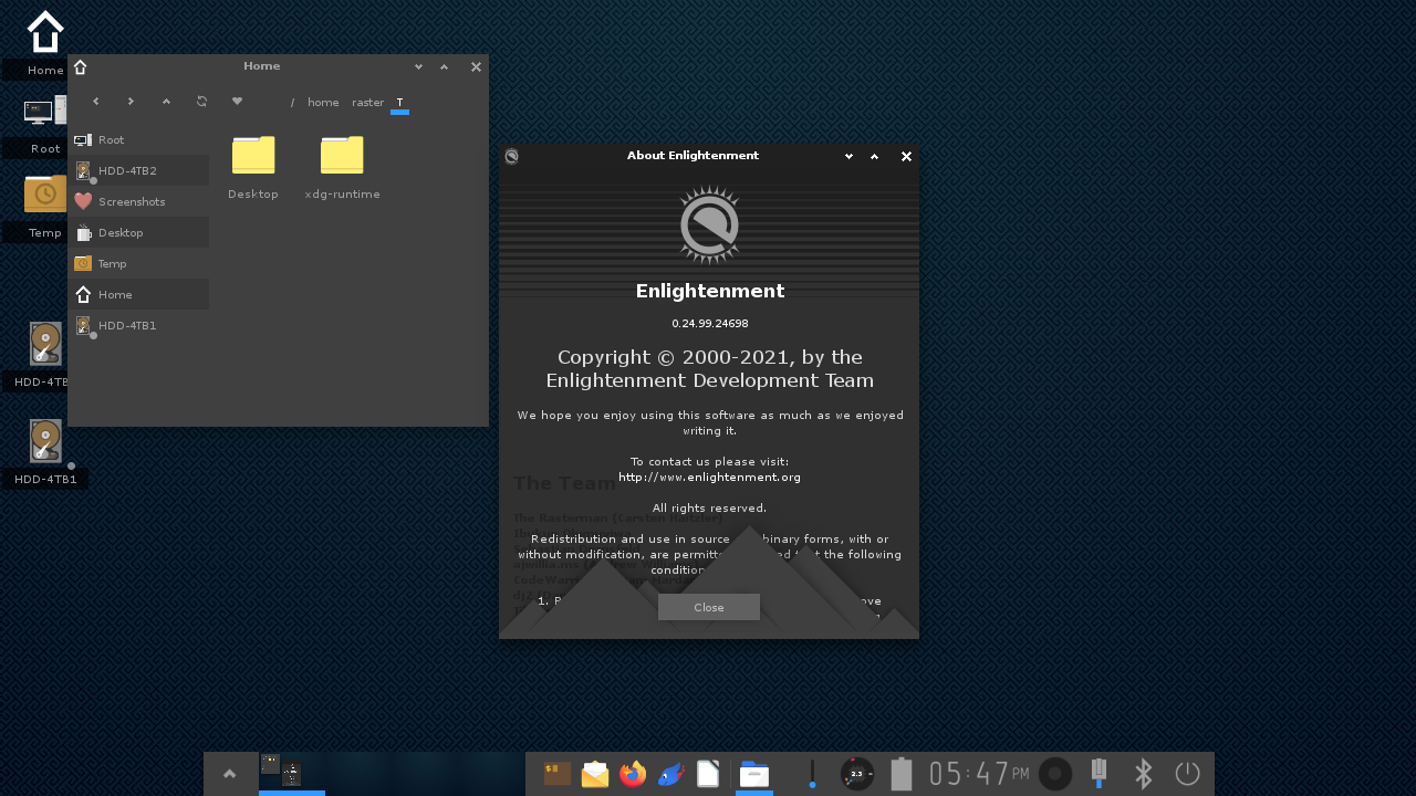
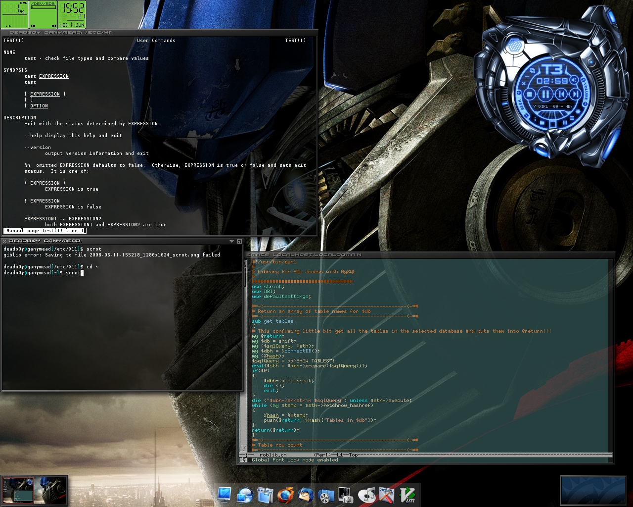
I want more stuff like this. The era 20 years ago (e.g. Enlightenment) was way more fun than the bland monotonic design we have these days. If you like bland modern design, great, that should be an option as well, but we should still have good variety.
> If you like bland modern design, great,
I don't know why anybody would. It takes all the lessons we learned about UX from user testing in the late 90s/early 00s and throws it all away to produce something that looks "clean" and "sleek", at the cost of being useful. Discoverability? Who needs it?
EDIT: Though I do enjoy skeuomorphism, I do think the TFA goes a bit too far.
> Discoverability? Who needs it?
It wouldn't be so important if things didn't change so much over the years. The CLI has stayed fairly consistent over the past 40 or so years. Can't say the same about GUI, though.
I wouldn't have to rediscover all functionality if designers didn't shuffle things around for no reason. Though, that's mostly a Windows thing, which I have to use for work.
Debatable. IIRC Bell labs conducted a study of whether Unix command names should be changed to something more meaningful than cat, sed, grep etc.
They found that words that convey some meaning related to what the command does had little or no effect on the user remembering what the command does. I strongly suspect skeuomorphism similarly has no claim on functional advantage.
Discoverability is good, but it's probably got a little to do with the icon.
> I strongly suspect skeuomorphism similarly has no claim on functional advantage.
I think it does, but for new users only. I hate playing the "is-this-a-button" on modern designs, not knowing what is clickable and what is not. Other games I hate:
- Lets find the scrollbar
- Guess which window has focus
- (Windows-only) Try to predict the application to get focus on alt-tab, then alt-tab again.
- How do I find the file that just downloaded?
> Always showing vital elements like the scrollbar isn't a skeuomorphic choice, it's always a good idea, they only started hiding them because it looked 'cleaner' to some UI designer.
There’s a lot of modern design in not happy with, but this is not personally one of them. If I can’t autohide scrollbars I try to turn them permanently off instead of permanently on. For some reason I find them very distracting, and since I anyway use a scroll wheel or trackpad or keybindings, I don’t need it to scroll. (If it’s on autohide, I use it as a progress bar when actually scrolling.).
But there’s a lot of these weird things that seemingly everyone else accepts that just really throws off my focus. Blinking text cursor is another one, I just can’t get any work done until the blinking is off. If an app or OS can’t do that, I won’t use it.
Absolutely. I keep falling into these traps. I just got a Mac, and it's terrible at these. It's notorious for hiding the scrollbar, but why would they make it hard to find the thing I just downloaded? Or a screenshot I just took? I can open it, but that doesn't take me to the file location so I can actually do something with it. Although Steam is by far the worst at that.
It's almost as if we didn't learn anything about UX in the past 30 years.
> Guess which window has focus
Used to be a solved problem before some ** messed it up. I hate that game too.
> none of them are automatically fixed with skeuomorphism
True.
But they absolutely need to stop hiding functionality in order to present a "clean" interface.
Sure, I've seen some cluttered interfaces. I recently launched LibreOffice Calc and damn there were a lot of buttons on that toolbar (I may be using an insanely old version).
But like...disappearing scrollbars makes zero sense and should never have been implemented on any interface.
oh gawd, please please please do not interpret this as pagination of windows with overflowing content!
the image carousel type dots or similar old skool pagination indicators are so much worse than a simple scroll bar.
I love knowing that a "Get-Foo" function in a library I've never before isn't going to have side-effects (unless malicious).
Conventions are great for UX.
https://learn.microsoft.com/en-us/powershell/scripting/devel...
Skeuomorphism isn't the only thing we've lost, and really it's the least important. We're talking smaller ideas, like widgets that aren't just black text on a white background (or if you like dark mode, white text on a grey background), visible scrollbars, menus.
That has nothing to do with discoverability. Discoverability isn't about "guessing" it's about being able to see it.
Discoverability in CLI is --help. But you can't discover you have to use --help. So CLI is always fundamentally worse than GUI.
It helps that for most cli tools, any incorrect usage will show the usage text, including --help
Man -k is often good for this
Re: too far - it’s interesting, because there’s two reasons skeumorphism “works” - one is because it provides visual cues for how a virtual object will behave when acted upon, which lets our brain build a quick intuitive understanding of how to interact with a foreign object that draws on all our experience outside the computer, and two is because the visual mimicry of the physical object gives our brains immediate cues to understand what it’s seeing and build that interaction model.
This one absolutely over indexes on that second principle, to a borderline cartoonish degree, but I expect the reason it’s resonating so hard is exactly what you’re indicating, that in the industry’s desire to be able to move on from the tether to the shapes of physical objects, they discarded that first principle entirely, instead of figuring out how to maintain the visual cues to form and operation in a new language.
(Here’s where I throw away all that credibility I just got from the prior two paragraphs: I actually think Liquid Glass is getting closer to a “skeumorphism without skeumorphism” than anything else I’ve seen out there.)
Modern design is not synonymous to dis-empowering design.
FWIW I love modern design, and I hate all these too clever skeuomorphs. Modern design is honest to the digital medium. I find its beauty lies, not in the quirky ways it tries to mimic real textures and objects, but by how it provides usable controls and information by applying basic design elements like spacing, alignment, color, typography, discovery, layered info density, etc. well.
None of these requires skeuomorphs. It is like the difference between thinking a website is visually impressive and stunning because it uses a nice background image. That would not impress me. What would impress me are stuff like: does it have an effective information architecture, as reflected in it main menu and general link structure? Does it use a tasteful and usable color scheme? Does it have an interesting and still usable visual grouping? Etc.
[dead]
Do all those toggle switches and dials and sliders actually help discovery for people who grew up with iPads? Maybe their function is only obvious to us dinosaurs.
> I don't know why anybody would.
Well, there's really two things going on here: consumer vs professional. Does an electrician need to "discover" the modes on her multimeter? Naw. Do I need to discover where the wiper controls are on the car I just rented? Absolutely! But I'm not a huge fan of UI fluff that helps me discover things on my work machine.
The idea of "one size fits all" was never true.
Weirdly, there is some kind of power play happening with OS UI: "MBA finally in position of influence wants to force their taste on everybody" appears to be a thing.
Your rental car comment reminds me of the time I looked like an idiot trying to open the fuel door on a rented Kia K5 for almost 20 minutes. I don't have a smartphone and didn't have my laptop so had no way to look anything up. Ended up finding this video on the gas station employee's phone (she came out to see if everything was okay. It was not okay.) https://www.youtube.com/watch?v=_e7lZmbjtNo
If you have to release a tutorial video to open your fuel filler door, and that video includes the one easy piece of user interface to do the thing getting thanos-snapped out of existence, I think you did something wrong.
The cause of my problem was I opened the driver's door before turning off the car. The rental didn't have push-to-start like my personal vehicle, and I don't have "turn and remove key" on the mind when exiting a vehicle. Even locking and unlocking the door didn't unlock the fuel door, I had to turn the car back on, lock the doors, turn the car off, then unlock the doors. Why is opening the fuel door so complicated? There doesn't seem to be any way to do it mechanically, so good luck when the solenoid dies.
Way too far. I don't want my desktop to look like a puzzle straight out of Myst, or a reinvention of Bob.
In fairness, this is Myst not Bob.
> Discoverability? Who needs it?
Most "flat" designed modern apps fail miserably at discovery. Most hide things in hamburger menus or require weird random swipes in odd directions with zero visual indicators.
As someone who runs a super-boring, stock tiler with zero decoration or bling; couldn't agree more. It's this kind of thing that gets new users interested in Linux. _I_ started using Linux because I saw some video of wobbly windows, and desktops on a giant rotating cube.
KDE 6, at least as the latest Kubuntu has it configured, has the wobble back by default.
It hasn't annoyed me enough to disable it just yet, but it's only been a week.
Me too! I was drawn to trying out Ubuntu from seeing all the cool Compiz effects.
I still run the Burn My Windows Gnome extension on all my desktops with a short "TV Effect" activated when a windows closes. It's just perfect!
That was Compiz iirc. I remember turning it on for a laugh.
It's probably not the same one, but I suddenly had Project Looking Glass flashbacks
I look back at my Enlightenment desktop with joy. I guess many people hated all the tinkering with drivers & settings etc, but I loved it. Spending a few weekends getting a computer running with Linux and Enlightenment exactly like I wanted it to and then actually using that as my main driver for years are very nice memories.
> Spending a few weekends getting a computer running with Linux and Enlightenment exactly like I wanted it to and then actually using that as my main driver for years are very nice memories.
Years? The novelty wore off in a week with Enlightenment's constant crashing :-(
Anyway, I look forward to more Window Managers (Hell, even a whole DE) that put the fun and whimsy back into computing.
I used to use e17 on my daily driver phone. Illume was a nice UI, but you (or your distro) did have to find a good revision to not have it crash indeed :)
My distro was Slackware, prior to any sort of package management, so, yeah, things would crash, but IIRC, Enlightenment, as much as I loved the use, look and feel, just crashed way too often.
What stops you from using it now?
>if you like bland, that should be an option too
That's the main thing we lost, isn't it? Options. I remember playing with so many different themes back in the day.
Call me insane but I still think xfce and Enlightenment should do a fusion become one project. Get rid of the GNOME shenanigans on GTK and rewrite all xfce apps and stuff in the e libraries.
What do you mean 20 years ago? I still use enlightenment today (Moksha Desktop)
> What do you mean 20 years ago? I still use enlightenment today (Moksha Desktop)
Enlightenment today (https://www.enlightenment.org/_media/aa/shot-2021-12-13_17-4...) looks nowhere nearly as cool as it used to:
https://imgur.com/enlightenment-are-we-posting-throwbacks-de...
http://robert.thegeakes.co.uk/images/elive.jpg
https://commons.wikimedia.org/wiki/File:E17_screenshot.jpg
https://www.reddit.com/r/unixporn/comments/fq4y3c/e17_found_...
If the 23oz Of Glass or Orange Juice themes are usable I’ll switch right now
e16/e17 was a lot of fun, and it was fast.
e17 (Moksha) IS still fun!
I would like a Linux desktop that doesn't suck first, then they can make it pretty. Every Linux desktop I've used in the past decade is either so minimal it's barely usable, or so feature-filled it takes up gigs of ram, or in the middle with broken clunky features (where I am now with LXQt). And the worst thing is, it's all the same goddamn thing as what we had 20 years ago, but somehow keeps getting rewritten to be slower and suckier.
Give Mint Debian a try - I've been very happy with it.
I installed Debian with KDE on a couple of non-techy relatives' mid-range laptops around Covid, and in spite of KDE being notorious for its abundance of features, neither of those relatives have ever complained about slowness or lag. That era seems far in the past now.
This looks like something that heavily relies on a pointer device and thus is the opposite of what I want. But it can probably work well for people not minding this detail. Might even work better in VR.
This will be the chance of the Linux desktop to thrive.
In the past ui development was so hard and none of the app developers had the expertise or appetite to do it properly.
LLMs changed that overnight. A good engineer can build great UI for their app.
The main difficulty I see in these "RETVRN TO SOVL" things is not the window-manager or desktop itself but the UI toolkits for the applications. GTK2 had so many excellent themes. Now GTK or libadwaita seem designed to resist themes and introduce constant breaking of selectors or widgets or whatnot. I believe they griefed the themers into just giving up. I have less knowledge about Qt, but I assume it's probably the better pick these days.
This warms my heart.
I was just thinking about this the other week, when I bought an old iPhone, from the skeumorphic era, for nostalgic purposes. I've wanted one for years -- I only had the newer ones that were flat.
I always thought, nah, I'm just seeing thru rose tinted glasses, surely it wasn't that cool, I'm gonna be disappointed...
Well, I finally got one, and oh boy. It's even better than I imagined. There's just so much love and care put into the designs. We really lost something special.
(p.s. if you get a really old iPhone, don't reset the device. It's impossible to activate them now, found out the hard way.)
I stand by that OS X Maverick was the most beautiful of all the macOS releases.
Actually that OS in general is what convinced me to buy a mac in like 2014; it felt like nearly every criticism I had with macOS at the time had been addressed. I miss those days.
I thought Maverick reduced the skeuomorphism, I was glad to see it removed. Apple had got to a point where shadows and reflections weren't consistent between icons and windows and the Dock. Briefly, Microsoft lead good design with Metro and the flat, minimal background noise.
https://en.wikipedia.org/wiki/Metro_(design_language)
https://www.macworld.com/article/222218/get-to-know-os-x-mav...
I felt like Mavericks had just the right amount of skeuomorphism. Not enough to be annoying but just enough to be aesthetic.
I was never a fan of the Metro flat design that took over, though admittedly my desktop now is a purposefully unsexy Sway desktop that is completely flat and I do like that.
I'm typically not a big proponent of skeuomorphism, but it's nice to have actual variety of experimental options, a bit like the crazy things people did with UIs back in the old days.
This is very funny. But I think it would make me feel like I was working inside of Papers Please or some similar game.
Most people are to one degree or another.
Man, first Felix Reiseberg[0], then OpenCode 2.0[1], and now this in the last 24 hrs. Really giving off heavy Myst vibes. They are briefly interesting encounters, buy I deeply hope this isn't a legitimate UI trend.
It's hardly even skeuomorphism, it's a almost digital twin rendered with Phong.
The README being so full of AI prose is super grating.
> the kind iOS 6 had
> The room is ray-traced
imho, part of the charm of iOS6 was that everything was baked into native-resolution textures.
I feel like that was simply a limitation of the hardware at the time. Given modern hardware, I'm willing to bet that people of the 2000s would have made wild stuff.
Totally. Using Windows Vista Ultimate just for using Windows DreamScene ( e.g playing a video as a desktop background). Totally dumb, totally destroyed performance, totally cool :D
Love skeuomorphism. This just gave me a reminder to build a paper-like calendar app now, with pencil markings showing events.
I definitely don't want a skeuomorphic desktop, but little web-apps, text editors, chat apps? I say we need a lot more of this type of design there, especially with how good modern CSS is at this kind of thing.
> Windows are sheets of paper on a walnut desk.
The calculator is a sheet of paper..
Do you want your desktop to feel like a 90s adventure mystery game by Sierra.. Well boy do I have the desktop for you!
> DEsk is Desktop Environment and desk in one word
They dropped the ball:
DESk would have been Desktop Environment, desk, and Skeumorphic in one word.
Or go full acronym with Kit for the K as in "Developer Kit".
I love this. Hopefully we start to see more experiments like this.
I like when designers are creative.
This is lovely. I really hope society returns to chasing beauty again. We need it.
But will this make a billion dollars and let me force my bizarre beliefs on the world?
Agreed. Greed is consuming everything before our eyes.
I always think about video game UI's when I read the skeuomorphic design arugments. I suspect video games use them, at the very least, because they are delightful and fun; which, in my opinion, is a good reason to do something anywhere.
I will say that a long time ago I installed enlightenment and after about 10 minutes the burning windows felt like they were getting in the way, so I guess, like everything, there should be balance.
This is neat, it’s not for me (I prefer extreme minimalism) but I could see how some would prefer it. I like how we’re getting more desktop options now thanks to wlroots.
Flashback to TabWorks.
Compaq Presario 486 1994, I was 10.
And yes, played Myst on it.
Tempus fugit…
Did it have that tiny rollerball on the side?
We bought a bunch of TabWorks-based Compaqs back then for a medical office where I was doing IT work. I thought it was slick at the time.
And did it have a Quantum Bigfoot hdd in it that you could never use again because of its size?
I see that this very bad idea is returning from the 90's.
I reckon a lot of the people clamoring for these things are gen z or younger first discovering the idea of customizable OS's and are now going through all the awful decisions that were made before. Pretty sure I've seen a version of this skeuomorphic desktop like 15 times at this point.
The children yearn for Microsoft Bob - which took this idea a bit further:
"Microsoft Bob presented screens showing a house, with rooms that the user could visit containing familiar objects corresponding to computer applications, such as a desk with pen and paper and a checkbook. Clicking on the pen and paper would open the system's word processor."
[dead]
In the last century, there was an app for Apple's Mac OS (before MacOSX), called Kaleidoscope[0]. It allowed massive customization.
Fun, but most themes were basically unusable.
[0] https://en.wikipedia.org/wiki/Kaleidoscope_(software)
Some samples: https://web.archive.org/web/20110709175639fw_/http://www.kal...
(The one I used the most, was Ozymandias II).
Some level of skeuomorphic design is quite nice, like what we saw from Apple during the Forstall era. It seemed to strike a good balance.
Something like Microsoft BOB takes the metaphor too far and gets weird.
I think this project leans on it a little too hard, but a balanced approach can make the systems quite charming and provide a nice juxtaposition to the very austere hardware we have these days.
Personally, I found skeuomorphic design to be something that I really enjoyed, for a couple of days, but rapidly got sick of.
That may have more to with the skills of the implementors, as opposed to the concept, as a whole.
I do find modern "flat" design to be less "fun," but I get a lot more done with it.
That might be the thing. In real life you don't use the same stationary for years. Your desk is a reflection of your mood and evolves almost daily. Maybe that's where these fail?
This is where themes come in.
Indeed, my mood most days is bland, monotonic, and flat, just like my desktop.
What's so bad about it?
He doesn't like it.
[dead]
I'd be into something as useful as Quartz Composer was for Desktop Widgets, but not a full skeuomorphic desktop.
Indigo Magic or CDE is as close as I'd want to go with that concept.
2004 was a long time ago, and I suppose what is old can be new (again).
Sorry, that doesn't look like a walnut desk. That looks like stained pine wood.
I thought we were done with the skeuomorphism craze back in the late 00s. (Thanks Apple). Is the trend coming back?
> Is the trend coming back?
Hopefully no.
the "paper windows" idea doesn't seem to have been done with as much soul as the rest of the ui. Just a turned up corner. I reckon something done there could really tie this together
A “dog-eared corner” in fact. The readme is painful to read if you have an aversion to Claude prose.
fwiw that is the standard term for that kind of fold (to the extent that it has its own wikipedia article), but I agree that the claude prose is gross.
I only skimmed the README, but I didn't notice any Claudisms.
I could read it comfortably, whereas usually I can't make it through even a paragraph from an LLM.
It's chock full of Claudisms!
> The room is ray-traced, and one desk lamp lights all of it.
> The first login draws the room once: a few seconds on a GPU, longer without one. After that it starts at once.
> Nothing here is a symbol for a thing on a desk.
> each is drawn to look like the real thing set down there
I could go on...
Fantastic. Giving me memories of MS Bob. Put a talking animal assistant in the corner and you’ve got it. Oh, and you could connect the assistant to an LLM of course.
Exactly what it reminded me of. Although a lot more functional.
But a lot less coherent personality. Bob had a somewhat coherent cartoon world aesthetic. This just looks like "TEMU Myst" to me.
HN crowd be like: THANKS GOD APPLE WILL NEVER OPEN-SOURCE THE DE SO WE CAN'T HAVE THEMES FOR INDIVIDUALS WHO WANTS THEM
themes are actually possible on macos
I think AR/XR glasses are going to start to become popular in the next couple of years and I think some mixed reality shells will have more physical/3d interfaces.
This adds to a belief that I have that UI design undergoes cycles like fashion, just that we haven't yet seen a complete cycle.
I can imagine this being really helpful for beginners and kids. It's hard to grok what windows and tabs are etc. without any context.
nice! would be cool to customize to different era's of office life ... or even a creative version, e.g. Picasso's desktop
That control panel looks fantastic! Too bad I don't wayland. Last I checked, Mathematica doesn't like it.
This is pretty cool! I'd use this, once out of beta.
(Bonus points for not throwing AI-tells at everyone in the README - much appreciated).
This looks like peak skeuomorphism. I like it, but ray-tracing the desktop sounds like overkill.
Fun, makes me think of Bumptop :)
I love this, at least from the screenshots. I'll test it out tomorrow. I hope this kind of design makes a comeback.
I can feel my shoulders unlocking looking at the screenshots.
BeOS of 2026?
fascinating, I recently was also exploring various skeuomorphic design pattern in Flutter and now this!
memory 4 GB (DEsk itself 200-450 MB)
This makes it interesting. I may try it out. Moksha uses 200 MB to 300 MB of RAM
Love it. Maximize skeuomorphic design.
Skeuomorphic design was a solution to teaching the customer how to use the digital product, but I wish we have more of its side effects like shadows, icons that pop and other things that are pleasant for the eye and depth.
I don't know if it's just because it was better or am I just tired of the current white (like #FFFFFF white) backgrounds with everything flat and not connected. I would like my browser tabs to be in the shape of a physical tab in notebooks.
It feels like UI design froze somewhere in the mid-2010s. There are some changes here and there, but it all looks similar and very bland.
I don't know if this is accurate, but I blame Windows 8 and, especially, Windows 10 for popularizing this extremely bland and boring design.
Coupled with steam frame headset this might be great experience.
How come the 'documents' are floating above the wood surface creating such deep drop shadows?
I am skeptical that a transition from X to Wayland is actually merited.
As for the post / the repo itself, this analysis:
https://www.salahadawi.com/hacker-news-ai-detector/50103338
suggests it is LLM-generated. Not sure what to make of it.
Very interesting concept but I doubt it's stable due to the amount of slopped code and I don't like that it requires a hodgepoge of libraries from different DEs.
Sweet
In Brett Victor's 2011 essay, "A Brief Rant on the Future of Interaction Design", he laid out the foundation for his critique of skeuomorphic design. He believes hands are our future.
https://worrydream.com/ABriefRantOnTheFutureOfInteractionDes...
On the visual pretense: "Pictures Under Glass sacrifice all the tactile richness of working with our hands, offering instead a hokey visual facade."
On touchscreens mimicking real objects without haptics: "Pictures Under Glass is an interaction paradigm of permanent numbness. It's a Novocaine drip to the wrist. It denies our hands what they do best."
On why this design path is short-sighted: "To me, claiming that Pictures Under Glass is the future of interaction is like claiming that black-and-white is the future of photography. It's obviously a transitional technology. And the sooner we transition, the better."
Please no, seriously, fuck skeumorphism. There's a reason everybody stopped using it.
Yes! Please bring back the soul we had with retro OS GUIs (and the speed)... it's time for a resurgence. Especially with new systems/RAM/GPUs/etc. not being a thing for quite a while for a lot of people now.
Please tell me it has coffee ring stains and spiral lined notebooks.
okay, now use this for a month and report back
I don't hate skeuomorphic design but come on man
The thing I hate with vibed apps the most is zero seconds spend on how things around what is being build are already structured and what problems was already solved, just focusing on shiny result.
`sudo sh scripts/install_debian.sh`, a 583 lines long script, basically now a whole software just to handle the installation of this project on one distribution, seriously? If we vibecode already, just do the normal packaging.
god please no
[dead]
[dead]
[dead]
This project highlights why designers hate skeuomorphism. Skeuomorphism looks tacky unless done very very well. Skeuomorphic design under Steve Jobs looked very good. This doesn't come close.
Personally I don't super care if a designer thinks I'm being tacky if its making my day to day more fun.

Singular and plural chassis are spelled the same, but that doesn't make it right! I'm more inclined to spell it chassises personally.